 So why do we still have so many public buildings that fail to take that into consideration?
Take a look at this picture. There is no cover over the “transition area” from the road to the front door of the store. Target put its big red balls out there to keep the cars ff the sidewalk but they didn’t think about people coming in from the rain. I particularly like the irony of the person in the black hoodie. He or she sits on the concrete planter between two empty benches, supposedly provided by the store, instead of the benches. At least the planter area is partially covered by trees
The rains this past Friday got me thinking again about modern building design. As far as we have come in building design concerning accessibility and comfort systems, architects and building owners remain inconsistent in dealing with the rain and snow. Perhaps they believe that the building vestibule serves the purpose of providing a transition point between the outside elements and the inside elements. In my opinion, the common vestibule is just not up to this task. It is too small and too far removed from the street.
This has always been one of my pet peeves of newer buildings. This shortcoming is not limited to retail either. You can find it in office buildings, libraries and cultural facilities too. When you approach these buildings with an umbrella in rainstorm, you often have to close the umbrella while still in the rain before you enter a store. Inevitably this simple process can give you a decent soaking, somewhat negating the value of the umbrella in the first place.
Some modern buildings, such as this branch of The Columbia Bank, make an attempt to address this failing but even this effort comes up a bit short.
 A better example is found in the old aluminum awning covering the sidewalk in front of Yates Market on Main Street in Ellicott City.

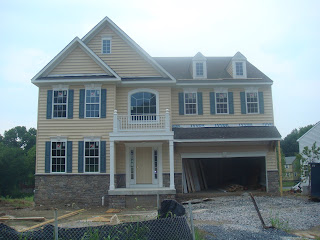
 This is what Dorsey Family Homes has built so far in the development. Does it “reflect the architecture of the historic house?”


 From the dog park I scooted down 29 to the


